Regarding the image attached - Excel can be used to display people, which site they are on at different points in the year.
The second table shows how MS project / primavera defaults to. Each site would have to be done as a seperate row/line item
Is there a way of making activities in primavera span across one line but on multiple dates? So i could have person A, B and C as a line each and then to the right see what site they are on like the top table i made in excel?
Ive asked an experienced project planner in the oil industry but he could not think of a way to do this
[[wysiwyg_imageupload:8542:]]
Thanks to everyone for a qucik reply!
Ive done more research and it look like yous are correct, dosent look as if Primavera can display an activity over one line.
This display format is called a swimlane format i believe.
Below is the format im wanting it in, Think excel still serves as the best for my needs/as a resource plan!
As I mentioned earlier, it might not be ideal, but you can simulate resource planning in P6. You can use the resource name as a WBS level, Activity Code, or Resource Name, then group and sort according to the selected options (WBS, Activity Code, Resource Name). Afterward, create an Activity Name such as 'Site name/location' or any required description. You can assign a different bar color per location by defining the bar and color using a filter for each location.
See below sample:
Once all activities (site names) are created and assigned based on the selected options (WBS, Activity Code, Resource Name), collapse them according to the chosen option (WBS, Activity Code, Resource Name).
See below:

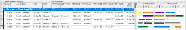
Alternatively, you can use user-defined date (UDF) bars to represent locations. Create multiple UDF start and finish bars to match the number of required locations. You can assign multiple UDFs (locations) per activity, and they will display as a single line in the Gantt chart.
See below sample using UDF:
I use different software that gives me out of the box a Resource Usage Chart. If P6 Resource Usage Table is not enough then you might consider the following.
The correct answer is NO.
While you can perform a walk-around to mimic resource planning software like ScheduleIT, Saviom, and many others, Primavera is not designed for this purpose.
See ScheduleIT sample: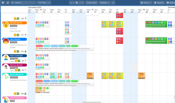
Saviom sample: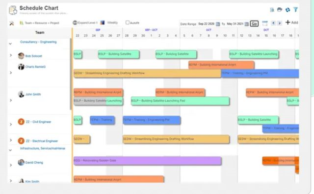
Group and sort Barchart by resource. Use project ID as the Barchart label 'above' the bar. Show bar when collapsed.
Group and sort Barchart by resource. Use project ID as the Barchart label 'above' the bar. Show bar when collapsed.
Group and sort Barchart by resource. Use project ID as the Barchart label 'above' the bar. Show bar when collapsed.
Group and sort Barchart by resource. Use project ID as the Barchart label 'above' the bar. Show bar when collapsed.