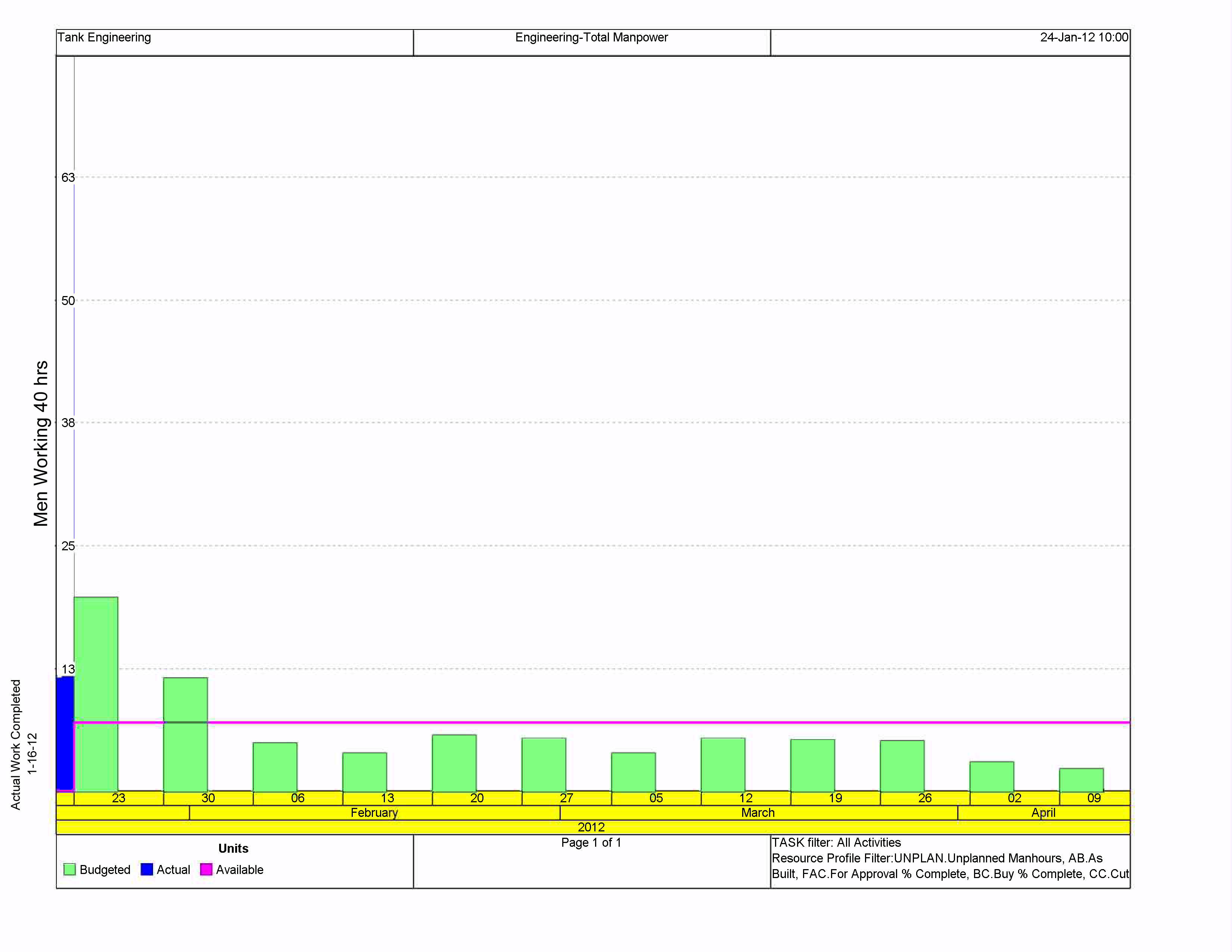
 basically I am trying to scale the numbers ( Men available) on the left hand side of the chart. The scale is causing some confusion in the office and seeing as I am new to P6 I am looking for some help. My boss would like to cap off the scale at 30 "manhours". Is this possible ? I am guessing it is just an easy fix I am missing. Thank you this is a great forum from what I have seen .
Help with scaling a Resource Usage Profile chart
Forum Sponsor
Top Posters
Julian Pegg
1 posts
Peter Nagy
2 posts
Raymund de Laza
17 posts
Syed_Asad
0 posts
Tony Greyvenstein
0 posts
Ahmed Al-Jubouri
13 posts
Umar Alvi
3 posts
Sibusiso Mahlalela
0 posts
Michael Samanyayi
3 posts
Simon Gumede
0 posts
Good morning,
may be this is the response :
In activity usage profile
Show usage for selected activities (not for all activities)
That also didnt work. What I am really trying to do is manualy alter the y axis numeric values. I want the graph to top out at 30 instead of 68.
Is this even possible?
I do not use P6 nor have it but believe horizontal/timescale you can adjust while the vertical is adjusted by the software using your histogram height and maximum versus minimum values.
If this is so probably the maximum values do happen at a different time not being shown.
Suggest trying to set the histogram to display only the selected values (manpower) for selected activities, for those occurring only at the time span of interest.
Best regards,
Rafael
Unfortunatley, this does not answer my question. I am looking to cap the total scale at 30 but it is showing up to 63+ due to a previous weeks high budgeted manhours .
Thank you for the help.
Good morning,
I hope I understand your question :
you go in the top of the graph ,"in display..." ,you right click and then choice options ,then in data change the scale by "unit"
I hope it's true and helpful
If it's not the solution ,and you have the solution , send me it
thank you