When dealing with Date Variance it might be convenient to have the following options.
- Days vs Hours - some jobs are scheduled by the hour, some jobs use workdays with different hours.
- Date difference vs. Activity Calendar - at times it is of interest to follow date difference, at times it makes sense to follow difference using activity calendar, at times it is good to compare both.

This can be done if using user defined fields and some formulas but I wonder if there is a direct way I might be missing.
Best Regards,
Rafael
For a single activity diagrams, templates and table reports works as expected. I take no issue on the diagrams when dates are mixed with other values, just create separate diagrams for a better view.
I am having issues when multiple activities are selected and with general reports. First version values are still missing; perhaps timescale could be expanded before project start to make some room for the display [something is shown]. I understand this is ongoing improvement.
To be able to pull down all this data from multiple schedule versions and get automatic variance calculations is good, very good.
I wonder why the formatting always by column instead of by parameter.
Am I getting something wrong?
Figured it out how to make the transfer, easy.
When we use two vertical scales in Excel we frequently use different Chart Types, usually lines & columns. Values and variance look better if using different scales. Maybe General Trend Parameters could be split to Numeric Parameters & Date Parameters, then variance shown as columns and values as lines similar to following figure. An option can be to allow Date Parameters only on UDF selection, by means of simple formula any Date Parameter might be available.
Uper left looks satisfactory but requires to show table together with the diagram.
This may be done.
The following I can also understand.
Let's suppose that one trend is 0 - 1 -3 -1 and another one 75 -76-78 -76.
It will not look nice with numbers and even less attractive with dates.
• The key is that for some lines, say solid lines, the scale are numeric values, for other lines, say dashed lines, the scales are Dates. Each vertical scale adjusted independently.
These shown values for date scale as well as for numeric scale need not to be aligned with every point. In most cases 4 to 6 values will be showm.
Dates that are shown with a number I am still wondering what they are I will never use. When mixed with numeric values it gets even worse.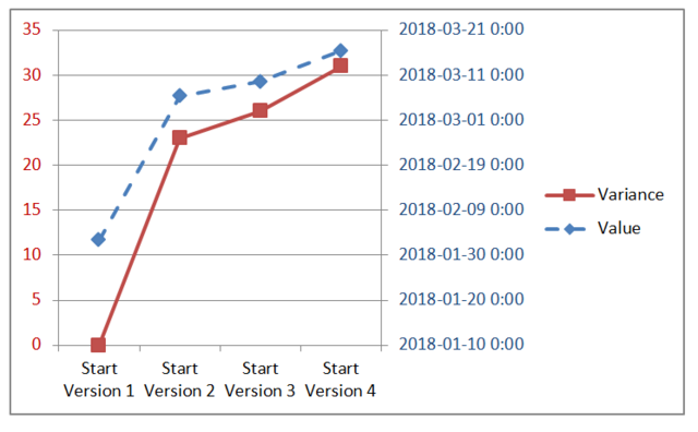
On the background Excel use numbers to adjust Date Scale. Excel displays the Dates not the numbers. Auto adjust did not adjusted Dates to their minimum preventing the lines to be on top of each other. It is all about how to display date values, what values or numbers are used on the background do not matter to the average end user.
Numbers show delays in days and delays of start and finish may be easily shown in the same diagram. Dates of start and finish may be very different, trends will start at different points and inserting readable dates is a problem. I think that values report shall be left in the table In any case the table may be exported to Excel for creating other presentations.
The vertical tables shall adjust automatically based on the range of values, from min to max value; the numbers will be shown in the diagram table as well as in the tabular reports. If user needs to get a more detailed diagram he will always be able to create separate diagrams or use table reports.
• Similar to project phases, for long duration activities the difference can be months, take for example a single delivery activity.
• For many reasons such as a design change due to unforeseen conditions the start of an individual activity might be delayed from version to version. So even if looking only at start only the difference can be months.
• In diagrams in most cases I would prefer to display Date not Date-Time.
• The difference will create same problems if using a number I am still wondering what it means.
• The key is that for some lines, say solid lines, the scale are numeric values, for other lines, say dashed lines, the scales are Dates. Each vertical scale adjusted independently.
• Definitively phase trends do matter, same as for individual activities.
• Diagrams saved as a template will be available to generate tabular reports where this issue with vertical scales will not happen.
I don't see problems with adding version numbers in trend table reports but it is now clear if it makes sense to show dates in the diagrams.
Let's suppose that we want to show both start and finish dates trends. For project phases the difference may be several months. Showing dates in the Y axis may become complicated. I don't see easy solution.
In order to delimit versions why not use markers, each marker representing an update period?
Also I think it would be easier to realise the following: insert an option in the diagram/table report wich will, show the version in brackets after the value of the parameter, something like this 22.00 [V1].
See image: https://ibb.co/k2nvxA
Something like: (but with date values in table using dates format)
After many updates if selected versions are not shown it can be difficult to figure it out.
- "We will need to forbid showing more than one trend in the same diagram."
Lines might be shown solid for numeric type and dashed for date type, or vice versa; this can be shown in the report legend so everything is crystal clear.
I am exploring what happens if a trend user defined field is set to numeric in one version and changed in another version to a a text type an issue not existing on standard fields.
Yes, I understand. Look at the table report.
We think about doing this in the diagrams because there is a problem when you will want to show several trends together (like time and cost trends or even trends of start and finish).
Variances are values that can be shown but dates and numbers require different scales. Start and Finish may have large difference and showing dates on the same scale may become tricky.
We will need to forbid to show more than one trend in the same diagram.
Vladimir,
This is what I got.
This is what I would understand.
Best Regards,
Rafael
Rafael,
try values trends for starts and finishes in the new version.
Best Regards,
Vladimir
Once again, thank you for your patience and tolerance with my requests.
Best Regards.
Rafael
Rafael,
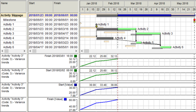
Variance trends show what happened with the selected parameter with each (or selected) updates.
The results can be shown in the table form or as the diagram.
Start variance shows how planned start date moved from the first version to the last.
Baseline version may change but variance trends will remain the same or other history (a set of the previous versions) shall be selected.
We expected that people are interested in the movements of selected parameters and that is why do not show dates but changes in start/finish dates.
Vladimir,
I am having issues to understand Start [Value], can you please help, maybe they are just temporary values, but if so why show them?
Why not show the dates?
I suppose when you generate trends a table is created, in such case to make it visible will make it easier to export the values to Excel or to a Spider Document.
Best Regards,
Rafael
Great, I will always be able to create a UDF for hours for few schedules when need be, no big deal, but the Days/unit reminder can be handy for the diagram labels.
I can also use date formulas to calculate difference using dates instead of activity work time.
Rafael,
we expected that when people look for trends of Start/Finish they are interested in dates and so show days as the only unit.
When people plan and analyze durations that may be interested in work days and hous.
Yes, adding days as measurement unit for Start and Finish trends is useful.
I am looking for Start and Finish trends. I suppose variance can be in days as well as hours, similar to Duration. Also variance can be measured as a date difference or as a calendar difference. Of course formulas and UDF can be used, as I currently do. I am just wondering. Perhhaps current Start/Finish should read "Start/Finish, Days" so it is cristal clear the unit.
Something like:
Duration trends are calculated in days or hours using activity (phase, project) calendars.
Dates difference shows time difference.