4.0 - MANAGING RISK & OPPORTUNITY
04.1 - Module 04-1 - Introduction to Managing Risk & Opportunity
04.2 - Module 04-2 - Develop Risk & Opportunity Policies & Procedures Manual
04.3 - Module 04-3 - Identify Risks / Opportunities
04.4 ASSESS, PRIORITISE AND QUANTIFY / OPPORTUNITIES
04.4.1 - INTRODUCTION
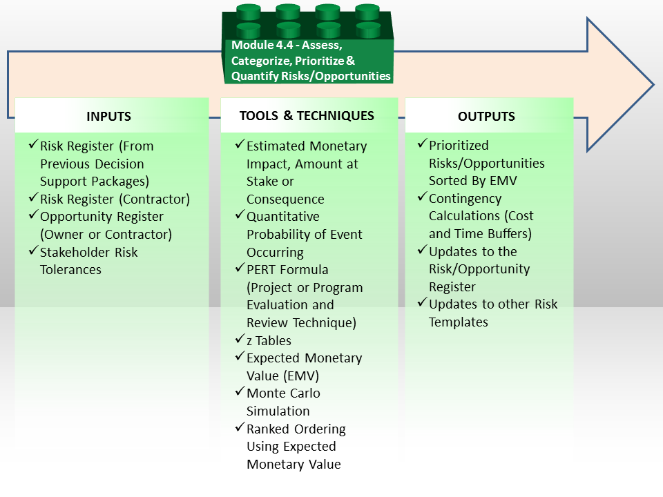
Figure 1 - The Assess, Categorize, Prioritize and Quantify Risks or Opportunities Process Map
Source: Guild of Project Controls
In Module 04-3 - Identify Risks / Opportunities we spent a large amount of time and energy working from the Riks/Opportunity Register (database) to help us in identifying risks / opportunities, assigning the appropriate coding structures, determining the type of risk, whether it is internal or external, systemic or project specific, assigning a risk owner and identifying what early warning signs we might look for. This Module is simply an extension of what was started in Module 04-3 - Identify Risks / Opportunities which enables us to:
(1) Step G - Determining the Probability of any risk or opportunity occurring
(2) Step H - Calculating the Monetary Impact of that event happening (Could be + or -)
(3) Step I - Calculating the Expected Monetary Value (EMV) of that event happening
(4) Step J - Rank Ordering the risks or opportunities
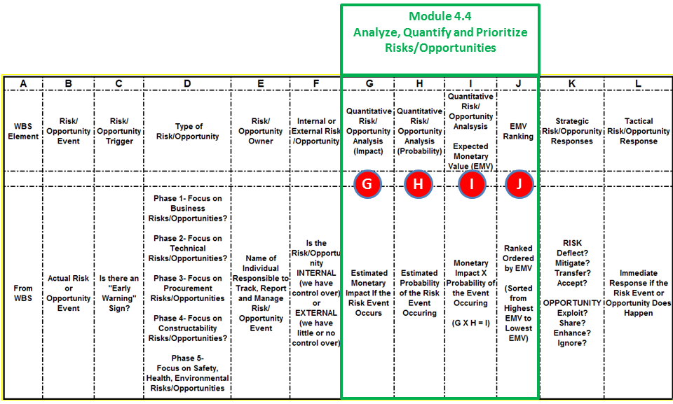
Figure 2 - Sample Risk Management Template Mapped to Module 4.3 - Idenify Risks & Opportunities
Source: Giammalvo, Paul D (2015) Course Materials. Contributed Under Creative Commons License BY v 4.0
Once risks have been identified, the next step in the process is to be able to quantify them, assess them and prioritize them in a logical and rational manner to present to the project sponsor, project manager or other stakeholders in order for them to be able to determine both the strategic and tactical responses.
The two major approaches to risk analysis are QUALITATIVE and QUANTITATIVE methods. While QUALITATIVE are very popular, the disadvantage from the perspective of the project controls professional is given we deal with real numbers- time, costs and probabilities, QUALITATIVE risk analysis is of little use for us until or unless they include probabilities, time and/or money.
04.4.1.01 - Qualitative Risk Analysis
Risk analysis is the systematic use of available information to develop an understanding of the risk.
Once risks have been identified, qualitative analysis is undertaken to prioritize or rank the risks so that the team can focus its efforts to define treatments, action plans, and recommendations on the most significant risks that matter. Risks that matter are those that can influence project objectives, irrespective of their probability of occurrence or severity of impact. (AACE, (2012), 62R-11: Risk Assessment: Identification and Qualitative Analysis. Association for the Advancement of Cost Engineering International)
Qualitative risk analysis is used to screen risks wherein risk probabilities of occurrence and impacts are expressed narratively or in ranked categories of severity. The qualitative analysis of the likelihood and impact of identified risks is typically based on a risk scoring matrix. The matrix lists the verbal measures and/or verbal descriptions of impacts to key project objectives (cost, schedule, environmental, etc.) against measures of probability of occurrence thus providing defined qualitative descriptions of result(s) of their interaction(s).
Figure 3 below shows a typical example of a risk scoring matrix:

Figure 3 - Risk Scoring Matrix
Source: (ISO, (2009), ISO 31000-2009: Risk Management - Principles and Guidelines)
As noted previously, until or unless QUALITATIVE risk analysis has values assigned to the quantitative attributes, they are of little or no use to the project control professional, who is expected to develop and provide QUANTITATIVE analysis to his/her key stakeholders in order for them to make informed and rational business decisions about the project as well as the product of the project.
04.4.1.02 - Quantitative Risk Analysis
Quantitative risk analysis is used to estimate a numerical value (usually probabilistic) on risk outcomes wherein risk probabilities of occurrence and impact values are used directly rather than expressing severity narratively or by ranking as in qualitative methods.
Figure 4 below illustrates the interaction between qualitative and quantitative risk analysis. It can be seen that the results of the qualitative analysis serve as an input into quantitative risk analysis.
Figure 4 - Interaction between Qualitative and Quantitative Risk Analysis
Source: Grey, S (2012) Project Cost and Schedule Modelling, in Palisade User Conference. Sydney
A number of methods exist to conduct quantitative risk analysis of cost and schedule and such analyses have traditionally been conducted separately and without reference to each other. This approach disregards the symbiotic relationship which exists between cost and schedule in a project. It is axiomatic that “time is money” in projects and project controls cannot be properly exercised by looking at cost and schedule performance in isolation.
The AACE has published a number of recommended practices to provide guidance in respect of quantitative risk analysis for projects and “RP57R-09: Integrated Cost and Schedule Analysis using Monte Carlo Simulation of a CPM Model” (“ICSRA”) is the preferred method for the purposes of project controls as it effectively integrates the relevant standard inputs/artefacts of the Project Controls activity.
In brief, the ICSRA method entails using the qualitative risk data from the various risk workshops and incorporate said data by means of a consolidated project risk register into a CPM compliant resource/cost-loaded schedule which forms the basis of the QRA model. Figure 5 provides an overview of the method.
Figure 5 - Integrated Cost-Schedule Risk Analysis
Source: Van Eeden Q (2014) Contributed Under Creative Commons BY v 4.0
Identified risks from the project risk register (including the results of the systemic risk evaluation) are mapped to the project activities (and their associated costs) within the QRA model which was derived from the CPM schedule of the project. The Monte Carlo technique is then used to simulate the effect of risk on the planned activities/cost in order to produce a range of possible outcomes for both schedule and cost as illustrated in the figures below.
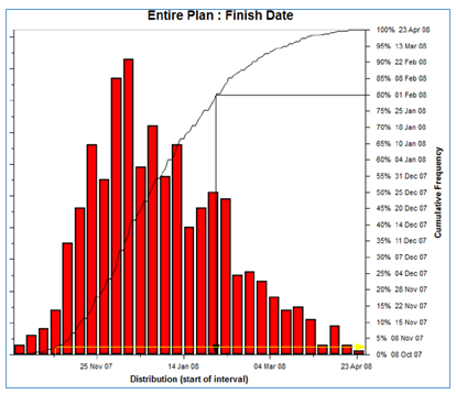
Figure 6 - Schedule Simulation Output
Source: Van Eeden Q (2014) Contributed Under Creative Commons BY v 4.0
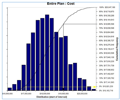
Figure 7 - Cost Simulation Output
Source: Van Eeden Q (2014) Contributed Under Creative Commons BY v 4.0
The results show that the project has less than a 5% probability of meeting its planned schedule and cost estimates (yellow arrow) and that in order to meet the risk criteria of the project (80% confidence), both schedule and cost contingency would be required to allow for the effect of the currently identified project risk.
The ICSRA results also provide guidance on which risks have the highest impact on the projects’ schedule and cost objectives as illustrated in the Tornado charts below.
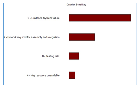
Figure 8 - ICSRA Guidance on Risks Highest Impact on Schedule and Cost Objectives
Source: Van Eeden Q (2014) Contributed Under Creative Commons BY v 4.0
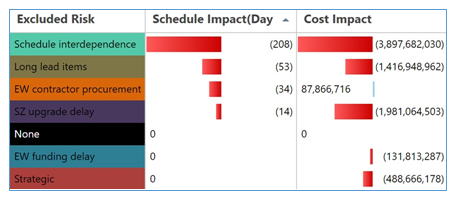
Figure 9 - ICSRA Guidance on Risks Highest Impact on Schedule and Cost Objectives (contd)
Source: Van Eeden Q (2014) Contributed Under Creative Commons BY v 4.0
This allows the project team to focus their risk response activities on those risks and activities which are the primary sources of project uncertainty.
The results of the ICSRA analysis are intended as input into the project decision making process and hence the analysis should be re-run to quantify the effect of changes in the project such as scope changes, the completion of risk response activities, the emergence of new risks, etc. The ICSRA analysis provides a consistent basis from which to exercise and measure the impact of project controls on an ongoing basis.
The primary benefit of the ICSRA method is that it establishes a causal and correlated relationship between identified risk and the as-planned deterministic cost and schedule estimates, by mapping risk directly to the affected schedule activities and their associated costs. The effect of uncertainty and the associated contingency requirements/actions are therefore calculated in real terms within the context of the project scope as opposed to the putative risk exposure and contingency values derived from simply “quantifying the risk register”.
Various software packages such as @Risk, Oracle Primavera Risk Analysis, ModelRisk, Full Monte, Safran, Polaris, etc. support the ICSRA method to varying degrees of usability.
The construction of an ICSRA model which accurately represents the project as planned and the risk profile thereof at time of analysis, is however a far more difficult and crucially important activity of quantitative risk analysis than simply being proficient at using a particular piece of software. From a Project Controls perspective, it is therefore important that the method/application used should be fit-for-purpose given the decision context, but more importantly, that an experienced, trained and skilled analyst undertake the quantitative analysis to such an extent that the ICSRA results reflect the realistic possible outcomes of the project so that decision makers can make quality decisions when sanctioning and executing the project.
Such decision making often requires a paradigm shift on the part of decision makers – away from accepting that deterministic, single point estimates of schedule and cost realistically represents the most likely project outcome, to probabilistic thinking and risk-based decision making wherein it is accepted that there is a range of possible project outcomes which need to be actively managed. “Risk management is project management for adults!” (Leach, P., (2006), Why can't You just Give me the Number?, in An Executives' Guide to using Probabilistic Thinking to Manage Risk and make Better Decisions)
- “Doubt is an unpleasant condition, but certainty is an absurd one” - Voltaire
The ICSRA method is accepted as international best practice for risk analysis and contingency determination by organisations such as the PMI, APM, CII, AACEi and ISO. Readers are referred to the AACE recommended practices (AACE, (2015), Total Cost Management Framework - an Integrated Approach to Portfolio, Program, and Project Management) and the handbook by David Hulett (Hulett, D.T., (2011), Integrated Cost-Schedule Risk Analysis) referenced herein for detailed information on the ICSRA method. Another practical example of how project control professionals actually apply the integration between a risk adjusted cost and schedule to help project sponsors and project managers make better business decisions can be shown in the graphic below.
For every construction project, the construction cost is the lowest (optimized by the contractor) at the baseline duration (4) and (7) Any deviation from this baseline schedule will result in increased construction costs. Expediting completion requires additional contractor effort through tighter schedules and overtime, additional resource mobilization and deployment and/or innovation, and incurs additional costs to the contractor. Extending the completion beyond the baseline duration results in penalty and misallocation and underutilization of resources, along with extended overhead, hence incurring additional costs to the contractor. In other words, the construction costs increase with each additional day saved (-) or delayed (+) from the standard or baseline schedule.
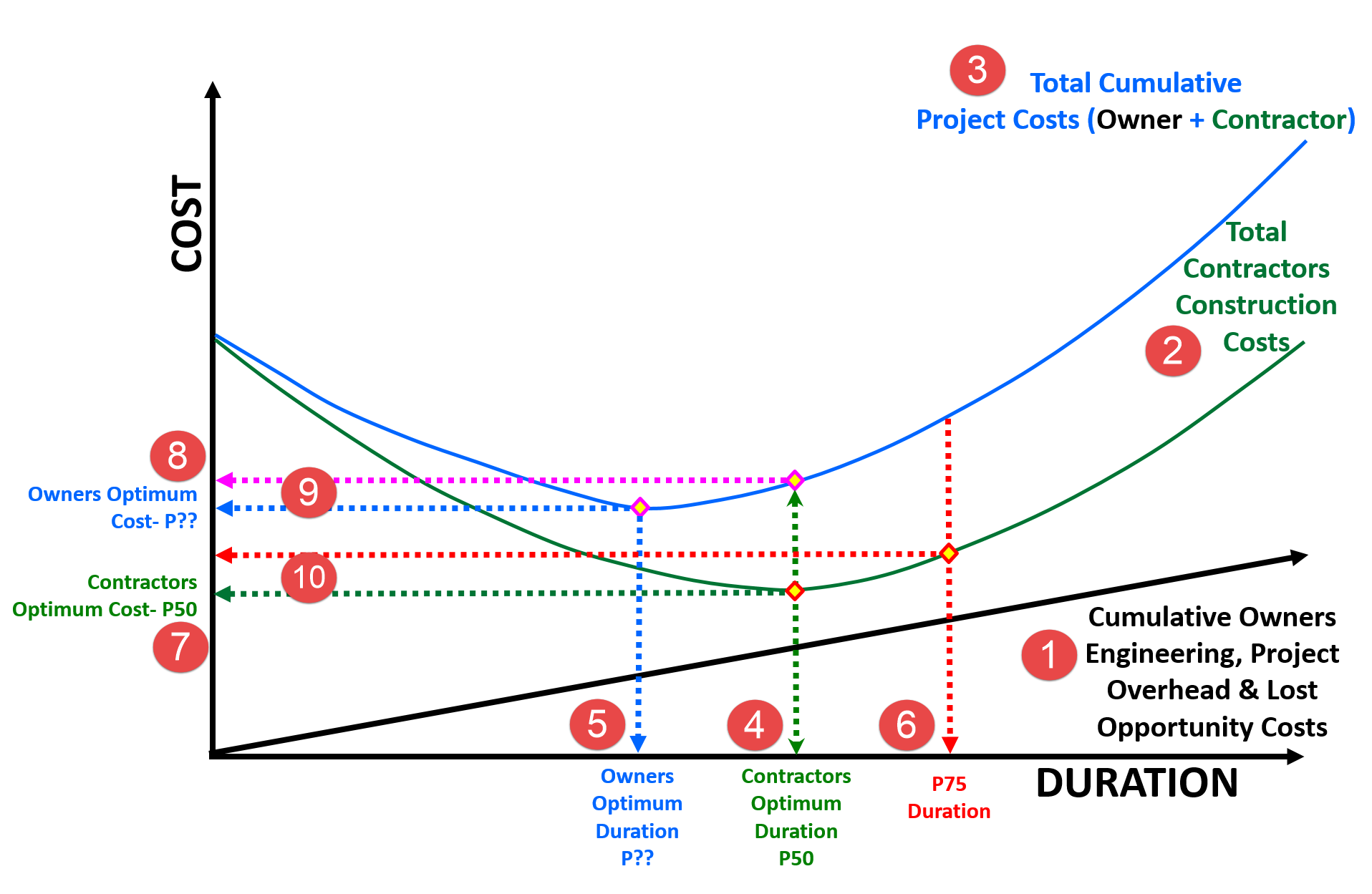
Figure 10 - Schedule vs. Time Optimization - Another Integrated Cost/Schedule Risk Analysis
Source: Work Zone Road User Costs Concepts and Applications (2011)
Given that the Owner’s optimum duration and cost is almost always different from that of the contractor, how can we equitably reconcile the differences? And the answer to that question comes from the differences between the Owner’s Optimum Cost (8) and where the Contractors Optimum Duration (4) intersects the Total Cost curve (9) This is what determines the incentive from the owner to the contractor to complete the project in the owner’s optimum time frame.
Conversely, if we look at the difference (10) between where the Contractors Optimum Cost (7) and the P75 Duration (determined using simulation) intersects the Contractors Cost curve (2) it provides us with the penalty or disincentive calculation (10)
For a more detailed explanation, along with the formulas, here is the reference:
US Dept. of Transportation, Federal Highway Agency, (2011) “Work Zone Road User Costs Concepts and Applications” FHWA-HOP-12-005
04.4.2 - INPUTS
- RISK REGISTER (FROM PREVIOUS DECISION SUPPORT PACKAGES)
- RISK REGISTER (CONTRACTOR)
- OPPORTUNITY REGISTER (OWNER OR CONTRACTOR)
- STAKEHOLDER RISK TOLERANCES
04.4.3 - TOOLS & TECHNIQUES
04.4.3.01 - Estimated Monetary Impact, Amount at Stake or Consequence
Refer Column G in Figure 2 above – Quantitative Impact or ”Consequence”. For planners and schedulers, you either need to do this yourself using historic data, lessons learned, PERT or engage the services of a cost estimator, quantity surveyor or forensic analyst to calculate the costs of a delay to the project.
From Figure 11 - Estimated Monetary Impact, Amount at Stake or Consequence right (Source: Work Zone Road User Costs Concepts and Applications 2011) and Figure 13 below, we can see that the cost of a day includes both the direct costs as well as the design and engineering costs plus the “lost opportunity” costs. (Identified here as Cumulative Costs but they can be any combination of direct as well as lost opportunity costs). Thus before we can perform this set of calculations, we must know the impact of a delay in the project to the owner or conversely, if we are exploring an opportunity, we need to know the cost savings of delivering the project a day early. This way, if one of our risk events indicates a potential time, its relative importance, or impact can be understood in monetary value.
In addition to the direct and lost opportunity costs, we also need to include any remedial costs and time required to fix or repair any damage done if the event is negative. The impacts of direct and consequential damages are covered in more detail in Module 12- Managing Forensic Analysis
To calculate the cost impact, we use the same cost estimating tools/techniques found in Module 8- Managing Cost Estimating and Budgeting but applied as part of the risk assessment process. The cost impact information may also come from insurance actuaries (actuarial tables), historic information or expert opinions.
04.4.3.01.1 - Monte Carlo Simulation
Another option is to use Monte Carlo Simulation software to predict what dates the project is likely to finish and what the cost profile looks like, both with varying degrees of probability or confidence levels.
Figure 12 – Monte Carlo Simulation Cost and time
Source: Van Eeden Q (2014) Contributed Under Creative Commons BY v 4.0
In the example above (Figure 13) to the left, we can see the results of a COST simulation, while the graphic to the right shows a SCHEDULE simulation. However, to be most useful for the project control professional requires that we INTEGRATE the results of the two simulations into a single graph. Thus we take the cost and time information, combine them to generate an optimization graph which shows:

Figure 13 Time and Cost Optimization Graphs
Source: Work Zone Road User Costs Concepts and Applications (2011)
(1) The owners direct costs as well as the lost opportunity costs
(2) Contractor’s Total Construction Cost
(3) Total Cumulative Costs
And from that, we can determine:
(4) Contractor’s Optimum Costs (Usually at or near P50 duration) which is often used as the “most likely” scenario.
(5) Owner’s DESIRED or TARGET duration (which is often at or near P40 or even less). For the purposes of statistical analysis this is usually considered to be the “best case” or “optimistic” duration.
(6) The “worst case” scenario which can be anywhere between P75 to P99.73 (+3 sigma) depending on how risk averse the stakeholders want to be.
The important part from the perspective of the project control professional is we use this information as the basis to establish both incentives to finish as early as possible as well as penalties for finishing late. This takes the risk information being largely an academic exercise to being a valuable and important assessment to present to the relevant stakeholders to help them make sound business decisions about the project.
But once again, in order to complete the risk analysis, we have to MONETIZE both the cost of delays as well as MONETIZE and ANALYZE the benefits of ACCELERATING the project. For those needing or wanting to understand the details of how to perform the calculations in the above graphic, the best source is the US Dept of Transportation’s Federal Highway Authority (2011) and “Work Zone Road User Costs Concepts and Applications”
04.4.3.02 - Quantitative Probability of Event Occurring
Refer Column H in Figure 2 above – Quantitative Probability or “Likelihood”
The second piece of QUANTITATIVE information a project control practitioner needs is the PROBABILITY that a risk event or opportunity will happen. Probability can come from many sources, including historical records, testing (mean time between failures), lessons learned OR it can come from subject matter experts, such forensic analysts, field people with many years’ experience or from insurance actuarial specialists.
As noted previously the use of QUALITATIVE risk/opportunity assessments is of little practical use for the project control professional. Why? Because we are data or numbers driven there is little the project control practitioner can do with QUALITATIVE assessments until or unless we put numbers to them.
Often such specific numbers are unavailable. The example below shows a traditional QUALITATIVE risk assessment matrix.
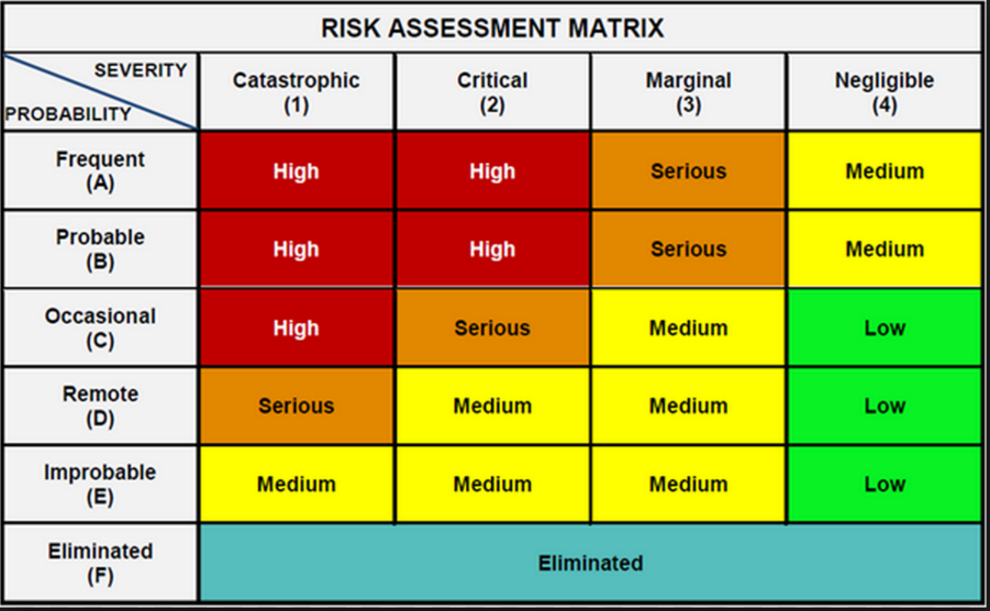
Figure 14 - Traditional QUALITATIVE Risk Assessment Matrix
Source: Van Eeden Q (2014) Contributed Under Creative Commons BY v 4.0
The problem with this is not only is it subjective, (i.e. what some might consider frequent, others may consider probable or what some may consider marginal, others would consider critical.), but the second limitation on using QUALITATIVE is there is nothing numerical we ideally need to QUANTIFY risk.
To get around this, the only way is to put numbers to both the PROBABILITY and the IMPACT or AMOUNT at stake. This will allow us to undertake a QUANTITATIVE risk analysis. Why? Because when we make recommendations or make decision we need to be able to explain the impact in terms of time and / or cost.
Thus the project control practitioner needs to QUANTIFY either in terms of MONEY or TIME or BOTH what the IMPACT of each risk or opportunity event. Without knowing the monetary or time impacts is of little practical value at the level of detail the project control professional is dealing with.
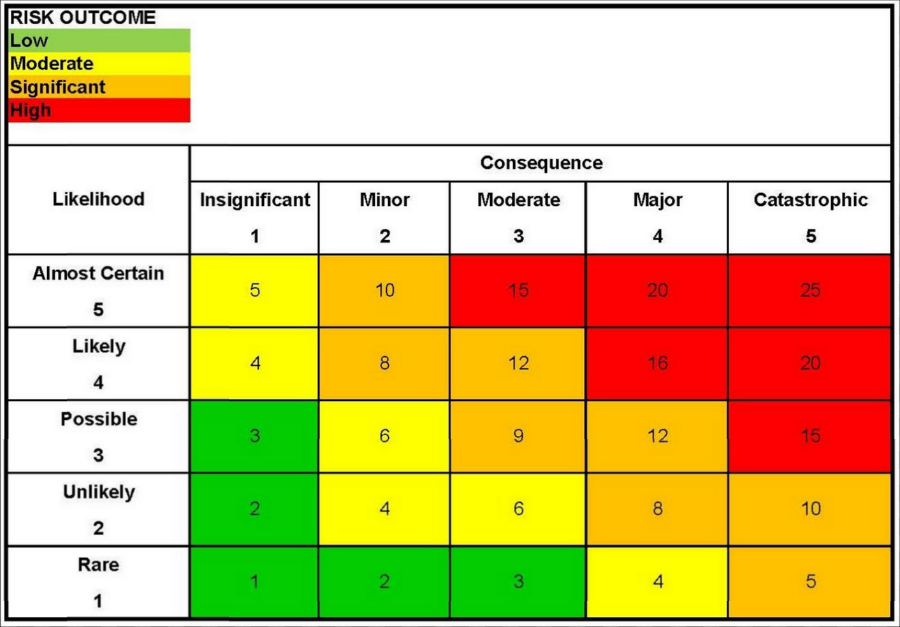
Figure 15 - Traditional QUALITATIVE Risk Assessment Matrix Converted to QUANTITATIVE Matrix
Source: Van Eeden Q (2014) Contributed Under Creative Commons BY v 4.0
The above impact matrix can be converted to become a quantitative assessment, in order to achieve this, the project Risk Consequence (Impact) Scale could be categorised as follows:
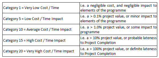
Figure 16 - Risk Consequence (Impact) Scale
Source: Guild of Project Controls
The impact values can be amended to suit the project being analysed.
Another consideration is to find out from the project sponsors whether time is more important than cost or cost is more important than time. If time is more important than cost (as it often is) then we would be calculating the optimum duration, while if cost was more important than time, then we would be using the cost optimized or “normal” duration.
Once we know the “cost” (or value) of a day then we can apply the PERT Formula or run a simulation using any one of a number of Monte Carlo Simulation software programs to come up with a probability of finishing on any given date.
Using data from historical information; from “lessons learned”; commercial databases or from expert opinions, we can apply the PERT Formula (see below) to help us calculate either the Amount at Stake or the Probability.
Alternatively if a specific probability value is not available the likelihood can be established using a categorised QUANTITATIVE assessment. The project Risk Likelihood Scale could be categorised as follows:
Figure 17 - The project Risk Likelihood Scale
Source: Guild of Project Controls
The probability numbers can be amended to suit the project being analysed.
04.4.3.03 - PERT Formula (Project or Program Evaluation and Review Technique)
Refer Column G, H, I, L and M in Figure 2 above - The “Program Evaluation and Review Technique” (PERT) formula is the primary tool / technique we use in order to calculate not only IMPACT (Column G) and Probability (Column H) but also the Expected Monetary Value (Column I) but perhaps the most COMMON or USEFUL application is we use PERT to calculate CONTINGENCY be it time or money. This can be applied either STRATEGICALLY at the project level (Column K) or TACTICALLY at the Work Package or Activity Level. (Column L)Explained simply, the PERT formula enables us to take either cost or duration data from historic databases or from expert opinions and analyze it statistically to come up with 3 pieces of important information:
To calculate the MEAN, SIGMA and VARIANCE we need to capture three values:
- What is the MEAN or AVERAGE value of the data
- What is the SIGMA or standard deviation of the data
- What is the VARIANCE
Cost and duration data coming from historical databases normally takes the shape of a SKEWED RIGHT CURVE: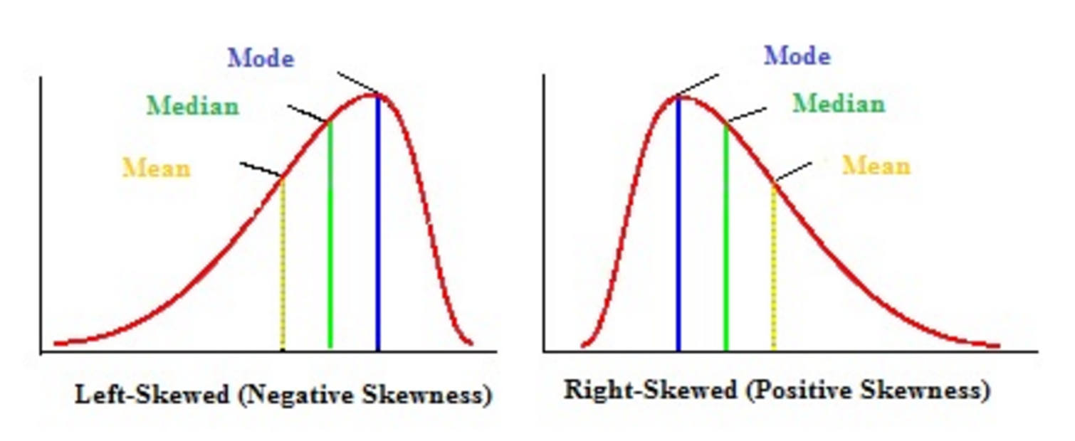 Figure 18 - Skewed Right Curve
Source: Andale (2013)
Because cost and duration data coming from historical databases normally takes the shape of a SKEWED RIGHT CURVE: in order to apply the PERT formula, using manual or hand calculation methods, we need to convert the positively skewed curve into a normal or bell shaped curve. To do this, we give the MEAN value a weighting factor of 4.
- Best Case or Optimistic Value or Shortest Time
- Most Likely or Mean Value or Likely Time
- Worst Case or Pessimistic Value or Longest Time
Thus the PERT formula is:
- (BEST or OPTIMISTIC value + (4 X the MEAN or AVERAGE value) + the WORST or PESSIMSTIC value) / 6 which turns the right skewed data into a bell or normal distribution.
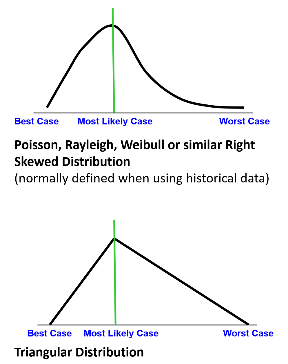
Figure 19 - Historical Databases vs Expert Opinion
Source: Giammalvo, Paul D (2015) Course Materials. Contributed Under Creative Commons License BY v 4.0
Historical Databases vs Expert Opinion show Data Distribution from Historical Databases vs Data Distribution Using Expert Opinion.
Regardless of whether the data comes from a historical database or it comes as a result of expert opinion, the curves will end up being positively skewed. (right skewed)
This makes working with the data MANUALLY very difficult as each set of data points will have a different shape.
To address this problem, we CONVERT the data from a positively or right skewed curve (i.e. Poisson,Raleih, Weibull etc) curve into a NORMAL or Bell shaped curve.
Why do we do this?
Because using a normal or bell shaped curve as the basis to do our data analysis provides us with some very powerful yet easy to use tools that can be applied to time, cost, probability or any other attribute which consists of numbers.
The figure below illustrates what happens when we take historic information (which normally is a skewed right (Poisson, Rayleigh or Weibull) distribution) or triangular data (which results when we obtain our data from subject matter experts) and turn it into normally distributed data, which we can work with more readily).
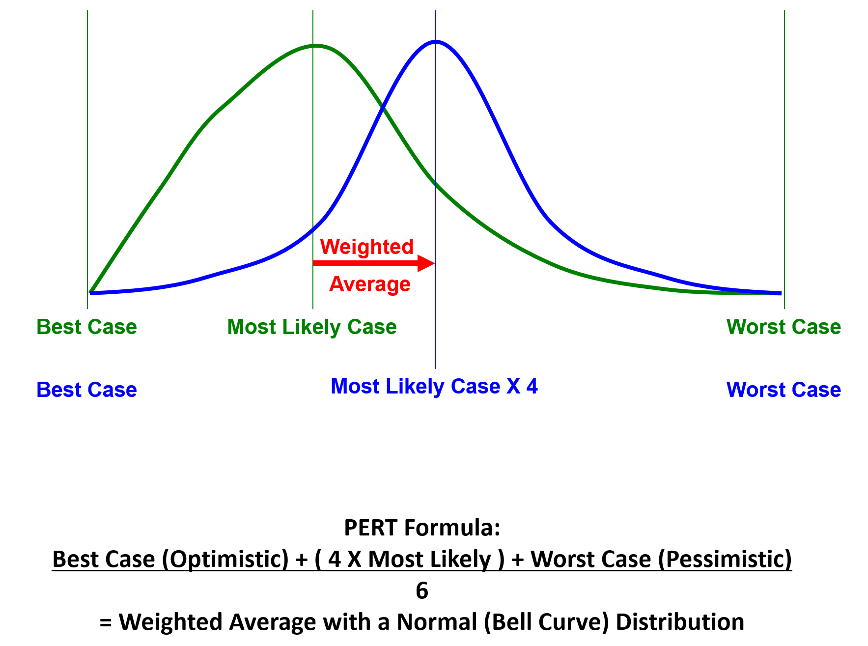
Figure 20 - PERT Formula Illustrated
Source: Giammalvo, Paul D (2015) Course Materials. Contributed Under Creative Commons License BY v 4.0
Once we have generated a NORMAL DISTRIBUTION CURVE what does it tell us?
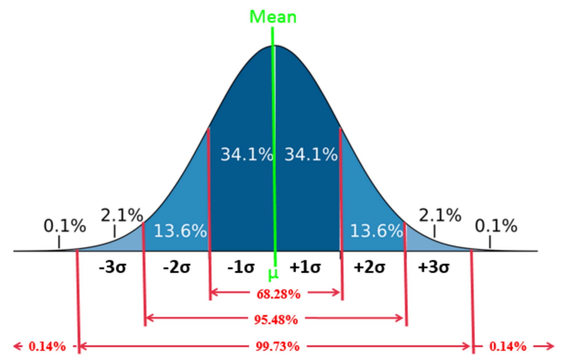
Figure 21 - Standard Bell Curve Values
Source: Giammalvo, Paul D (2015) Course Materials. Contributed Under Creative Commons License BY v 4.0
For any normal or bell curve, regardless of the shape of the curve, the area covered within + or – 3 sigma or standard deviations is always 99.6%, with the remaining 0.4% split between the area of the curve greater than 3 sigma and the area under the curve less than 3 sigma.
- For + or – 1 sigma the area under that portion of the curve is a CONSTANT 34.14%
- For + or – 2 Sigma, the area under that portion of the curve is a CONSTANT 13.60%
- For + or – 3 Sigma, the area under that portin of the curve is a CONSTANT 2.13%
- For those areas BEYOND + or – 3 Sigma, the area under those portions of the curve is 0.14%
The easiest way to explain the PERT formula and how to use it, is to walk you through a simple scenario.
KEEP IN MIND THAT WHILE THE CASE STUDY BELOW IS USING TIME AS THE EXAMPLE, THE SAME TOOL/TECHNIQUE CAN BE APPLIED TO PROBABILITY or COST; any set of numeric values.
CASE STUDY- You have done the same task many times. You know that the FASTEST you have ever been able to do it is 40 days and the longest this task has ever taken you is 80 days, but on average, you can do this task in 45 days.
- STEP 1 CALCULATE THE PERT WEIGHTED MEAN
(40 + (4 * 45) + 80)/6 = 300/6 = 50 days mean or average duration
- STEP 2 CALCULATE THE STANDARD DEVIATION OR SIGMA Ơ
Deduct the smallest value from the largest value and divide by 6
80-40 = 40 and 40/6 = 6.67 days sigma Ơ or Standard Deviation.
- STEP 3 CALCULATE THE VARIANCE
Variance = Sigma^2
6.67^2 = 44.5 days of which half is ABOVE the mean value and half is BELOW the mean value.
Why is calculating the variance important to us? The variance is an indication of how RELIABLE the data is. The more spread out it is (the larger the Sigma) the less reliable thus more risky it is. On the other hand, the less spread out the data, the more consistent it is thus it is less risky.
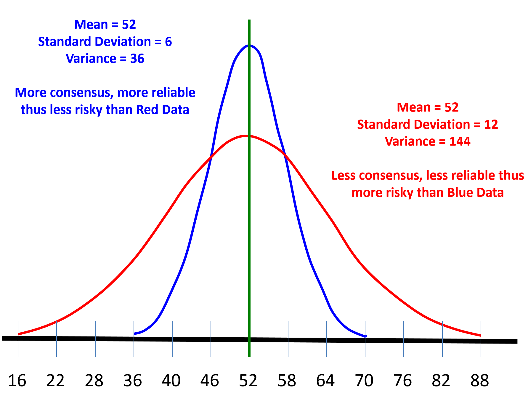
Figure 22 - Illustrating the importance of VARIANCE
Source: Giammalvo, Paul D (2015) Course Materials. Contributed Under Creative Commons License BY v 4.0
Project control practitioners do not have to worry too much about the actual numbers, as long as we remember one “rule of thumb”.
- IF the variance falls within +/- 3 sigma, then the data is reliable and the P or “comfort level” chosen by the key stakeholders is ok to use.
- IF the variance falls MORE than +/- 3 sigma, then it is advisable to recommend to the stakeholders that they choose a higher P, confidence or comfort level.
How do we use the values generated in our case study?
Figure 23 - Case Study Values
Source: Giammalvo, Paul D (2015) Course Materials. Contributed Under Creative Commons License BY v 4.0
As we can see from Figure 23 above, the orange values (0.14%, 2.13%, 13.6% and 34.13%) are constants and can be found on any z-table or bell curve. These represent the area under each portion of the curve and never change, not matter what the shape of the curve.
Based on the calculations shown above we know that:
(1) The mean is 50 days.
(2) The Sigma or Standard Deviation is 6.67 days.
(3) Which means that for each standard deviation BELOW the mean, we DEDUCT 6.67 days from the mean and for each standard deviation ABOVE the mean we ADD 6.67 days to the mean. This explains where the durations come from.
(4) And the variance is 6.67 ^2 = 44.5 days, of which half is above the mean and half below the mean. (+/- 22.25 days)
What this tells us is the average is 50 days and for all intents and purposes, +/- 22 days gives us 100% probability of being achieved. Explained another way, if we allow between 28 days (i.e. 50 less 22 days) and 72 days (i.e. 50 + 22 days), we have a 99.73 % chance of the project , the phase or any specific activity or work package falling within that range.
OK so how do project control professionals use this data?
Figure 24 - Case Study Scenario Part 2
Source: Giammalvo, Paul D (2015) Course Materials. Contributed Under Creative Commons License BY v 4.0
Management comes to us and asks “Can this activity be done in 30 days or less?” And as a project control practitioner we respond “Yes it can (1) BUT, the probability of doing so is only about 0.14% (2) which is the area under that portion of the the bell curve. (3) Then we ask management “Well then what PROBABILITY or COMFORT LEVEL do you want to see?” And because most OWNER project managers or project sponsors tend to be more risk averse, normally they will come back with P85 or P90. For contractors, if they were to bid P90, they would almost never lose money, but at the same time, they would not be competitive, meaning at P90 they would win no bids. In most cases, contractors bid the project at between P55 and P75. To bid at P50 means that half the time they would lose money and half the time they would make money and given contractors historically work on single digit EBIT margins, any contractor bidding at P50 is gambling not contracting. This helps explain why the failure rate of contractors is so high.
As we can see in Figure 25 if management wants an 85% probability of the activity finishing on time, then they need to use day 57 which is the area under the curve for Mean +1 Sigma.
Note that while the case study was provided showing a scheduling application exactly the same formula applies just as well to money or any other quantifiable value (i,e. productivity or probability).
Figure 25 - Case Study Scenario Part 3
Source: Giammalvo, Paul D (2015) Course Materials. Contributed Under Creative Commons License BY v 4.0
In part three, we have continued exploring the cumulative probability for Day 30 (0.14%), Day 37 (2.27%), Day 43 (15.97%), Day 50 (50%) and now we look at the probability of finishing on Day 57 or less (1) and we can see that by adding up all the area under the curve (3) that we have a 0.14% + 2.13% + 13.6% + 34.13% + 34.13% = 84.13% (2) of finishing on or before day 57.
The next question is what if management wants some other probability, like P40 or P90. How can the project control professional determine what the duration or cost should be for any probability? The answer to that can be found in what is known as a z Table.
Here is an example using PROBABILITY (Column I) demonstrating how we could use Subject Matter Experts to help us determine that the probability (Figure 26) that a PROJECT, PHASE, WORK PACKAGE or ACTIVITY would finish late:
Figure 26 - Use of Subject Matter Experts to Determine Probability
Source: Giammalvo, Paul D (2015) Course Materials. Contributed Under Creative Commons License BY v 4.0
In this example we have put together 10 SME’s and as you can see, they do not all agree on what the best case, worst case and most likely probability the project will be late. So using NOMINAL GROUP TECHNIQUE we collected their combined wisdom and then using the PERT FORMULA, evaluated their inputs.
First we AVERAGED all their results to come up with a GROUP MEAN Best Case (33% probability of finishing late, Worst Case (87% probability of finishing late and Most likely (54% probability of finishing late. As you can see, this curve is heavily skewed to the right, which makes it difficult to use
Then we use those inputs to calculate the PERT WEIGHTED AVERAGE which is 56% and the Sigma or Standard Deviation, which is 9%. But now, because we have normalized the data into a BELL or NORMAL distribution there is a lot more we can do with it. Supposing management is RISK AVERSE and doesn’t want to use 56% in Column I. Supposing they want to INCREASE their BUFFER or RISK CONTINGENCY? Then if they want to increase their COMFORT LEVEL to 75% then instead of using 56% in Column I they would use 62%. Or if they were REALLY risk averse then they would increase the number they put in Column I to be 67% which means they only have a 10% chance that number will be exceeded. Note, that to find out how many sigma or standard deviations we need to get P75 (0.675) or P90, (1.29) we need to refer to the Z Table below
Lastly, by looking at the VARIANCE which is 9% squared, we see that 0.8%/2 = 0.4%. That means despite the appearance of the SME’s NOT being in agreement, in fact when looked at as a group, they are very close to consensus.
Now this same template could be used for COSTS or Number of Days Duration (TIME) by substituting actual project costs or actual project durations for comparable projects in place of SME’s. (i.e. Project 1-10 Costs or Project 1-10 Durations. Generally speaking, the larger the sample size the more reliable the results (the smaller the variance) but for project controls purposes if you can get a population of 10, you should have enough data to present to your stakeholders. (IF the variance is greater than +/- 3 sigma then you need to go to a higher P or confidence level)
04.4.3.04 - z Tables
Knowing and understanding how to use z tables is an essential skill set that all project control practitioners need to master, whether planning/scheduling, cost or forensic analysis.
This topic will be explored in more detail in Modules 7 Managing Planning and Scheduling and Module 8, Managing Cost Estimating and Budgeting, but for this module, all we need to know is how to read and apply what the z table tells us.
Step 1 is to determine what your stakeholder RISK TOLERANCE is. This should have been done in Module 2.3.3 Validating Stakeholder Expectations, but if it has not been done yet, then you need to do this.
As a general guideline, if your stakeholders are risk neutral, he/she will pick a P50 value, meaning there is a 50% probability that the activity will take longer and a 50% probability the activity will be shorter than the duration chosen. (NOTE this also applies to costs as well) Unfortunately, this is a common practice when we use “average” durations (or costs) and is one of the reasons our schedules and cost budgets tend to be overly optimistic.
If your stakeholders are risk seeking or risk loving, they tend to pick P40 values, meaning there is a 40% chance the duration or cost will be less than the value being used and a 60% probability the cost or duration will exceed the value chosen.
If your stakeholder is risk averse, then they tend to choose P90 values, meaning there is a 90% probability that the duration or cost will be less than the value chosen and a 10% chance that the cost or duration being used will be exceeded.
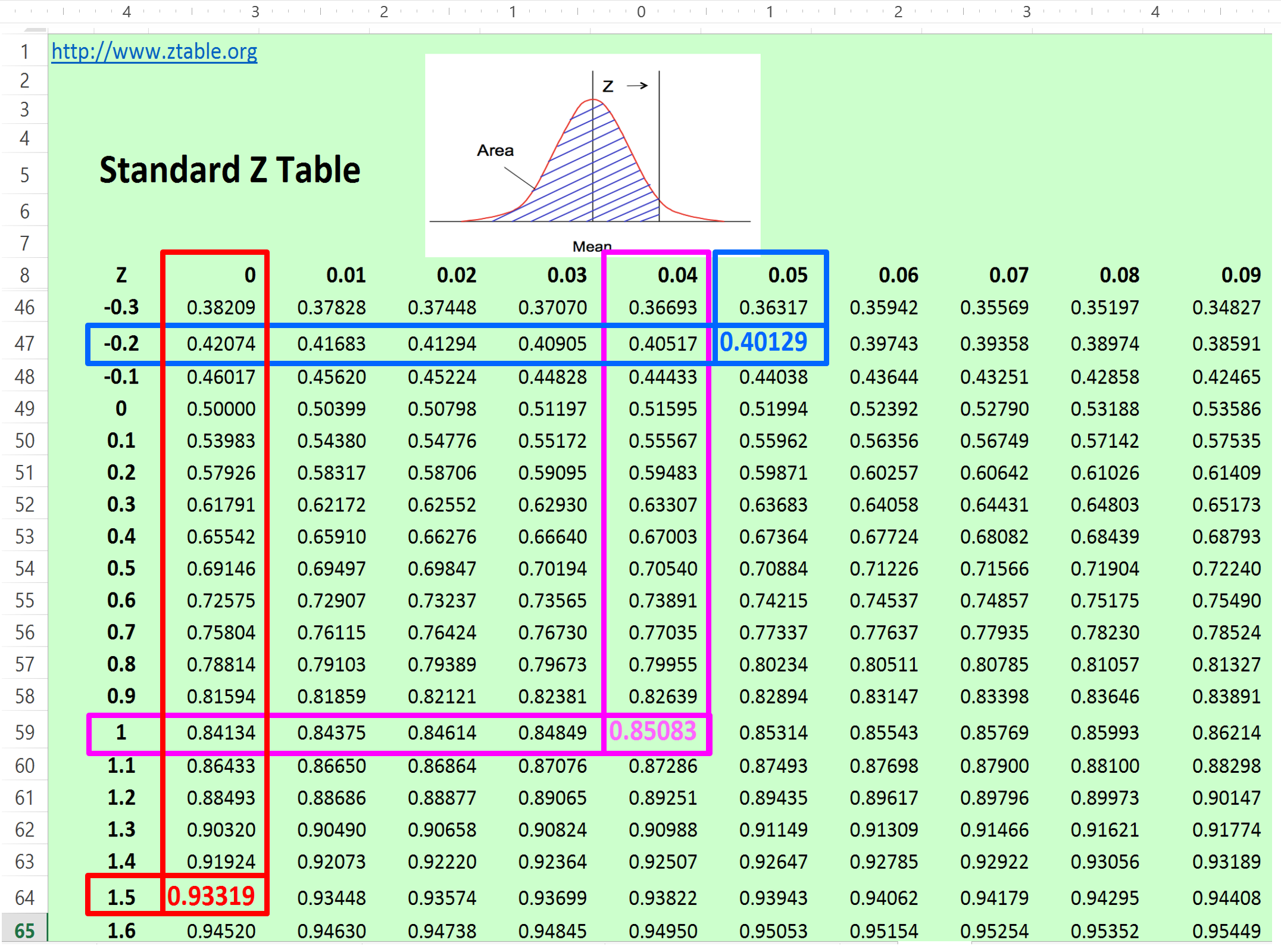
Figure 27 - Standard Z Table
Source: Giammalvo, Paul D (2015) Course Materials. Contributed Under Creative Commons License BY v 4.0
There are two ways to use this table. The most common is given a probability we convert that to standard deviations. Example- management says they want a P85 comfort level or probability that a cost or duration value will not be exceeded. We first find 85% (0.85) on the z table above. Then following the row horizontally, we see that P85 is equal to 1.?? sigma or standard deviations. Then we move vertically from the 0.85 probability and we see 0.04. Then we add the two values and end up with 1.04 standard deviations equals’ 85% probability. Explained another way, if we want to get 0.85% probability of a cost or duration NOT being exceeded, it requires us to ADD 1.04 sigma to the Mean value. Using our previous example, we had a mean of 50 days and a standard deviation of 6.67 days so to be perfectly accurate we would take the mean (50 days + (1.04 * 6.67)) = 56.94 days or day 57.
How about if management wants P40? How many days would we have to enter as our target duration? Well we can see that 0.40 is -0.25 sigma meaning we start with day 50 (mean) and multiplying 6.67 x -0.25 the result is 50 + (-1.7) = Day 48. Explained another way, if management only drops the duration by 2 days, the probability of finishing drops from 50% to only 40%. This is shocking information to most managers and it is critical that the true professional project control practitioner is able to communicate this effectively to his/her management.
The second way you can use this table is knowing how many standard deviations there are, you can calculate what the probability is. Explained another way, 1.5 sigma will give you 93.3% probability of finishing on or ahead of schedule and 3 sigma will give you 0.9987 or 99.9% probability of finishing on or before the entered duration (or under the allocated budget in the case of money).
For those who are unfamiliar with this or need to brush up, here are several recommended references:
- Bourne M (n.d.) http://www.intmath.com/counting-probability/z-table.php
- Thomas, Christopher (2013) - https://www.youtube.com/watch?v=85G_PLBTX00
- Math is Fun (2013) http://www.mathsisfun.com/data/standard-normal-distribution-table.html
04.4.3.05 - Expected Monetary Value (EMV)
Refer Column I in Figure 2 above – Expected Monetary Value. In order to calculate Expected Monetary Value (EMV) we need two pieces of information:
(1) The amount at stake or impact which is always expressed in monetary terms. (Column G in the Risk Register spreadsheet) This means for our planning and scheduling people you either need to learn how to calculate the costs or value of a day or bring in cost practitioner to assist you. The amount at stake can be calculated using the PERT FORMULA above based either on historical data or based on the opinions of subject matter experts. Management is then free to use whatever Pvalue they are COMFORTABLE using. (P50, P85, P90 whatever)
(2) The PROBABILITY of an event happening which can come from historical data, manufacturers data sheets (i.e. mean time between failures or MTBF); insurance professionals (actuarial tables) or even using brainstorming techniques and asking subject matter experts either in house or externally. Here again if we have more than one probability (i.e. coming from a group of SME’s) then we can take their combined opinions, apply the PERT FORMULA to their expert data, to come up with a P50, P85, P90 or whatever probability management feels comfortable using.
- To calculate EMV all you do is multiply the amount at stake (Column G) X probability (Column H) and it gives you the Expected Monetary Value or EMV. (Column I)
How do we use this information? The first way we use it is to PRIORITIZE which risks we are willing to accept and which opportunities we are going to ignore. Normally, the project controls team prepares this document with all the risks, does the calculations and then sorts the risks by EMV. They present this to management and they decide which EMV’s are small enough values that they will either accept the risk of a negative event happening or ignore a potential opportunity.
04.4.3.06 - Monte Carlo Simulation
Another tool/technique we can use as the basis to calculate EXPECTED DURATION (column H), PROBABILITY (column I) or CONTINGENCY (Columns K or L) either in terms of time or money is to use Monte Carlo Simulation.
Our Business Dictionary definition of “Monte Carlo Simulation” is “Computation intensive forecasting technique applied where statistical analysis is extremely cumbersome due to the complexity of a problem (such as queuing or waiting line probabilities, or inventories involving millions of items). Used only where the problem has a chance (random) component, and is subject to unpredictable influences, it simulates (models) a situation on the basis of current and past (historical) data. In the simulation process, it computes an equation (mathematical model) thousands or millions of times, each time injecting random numbers to come up with a range of possibilities or outcomes of possible actions. Larger the number of computations, the greater the probability (according to the law of large numbers) of approximating the future events-provided the maximum-amount of known-data is incorporated into the model. Named after the Mediterranean resort of Monte Carlo in Monaco (famous for its gambling casinos) where sophisticated betters employ scientific methods to enhance their chances to win.
Monte Carlo Simulation is based on random number generation or GAMING Theory, hence the use of the term “Monte Carlo” as in gambling.
The advantage of using Monte Carlo simulation over PERT is that not only is Monte Carlo Simulation a dynamic model as opposed to PERT which is static set of calculations, but that instead of having to “force fit” the data from a SKEWED RIGHT curve to a Normal Bell Curve, we can select the curve that the simulation software uses which best fits the curve of our real data.
Let’s explore a case study below to demonstrate how to combine simulation to find the optimum duration given a fixed budget.
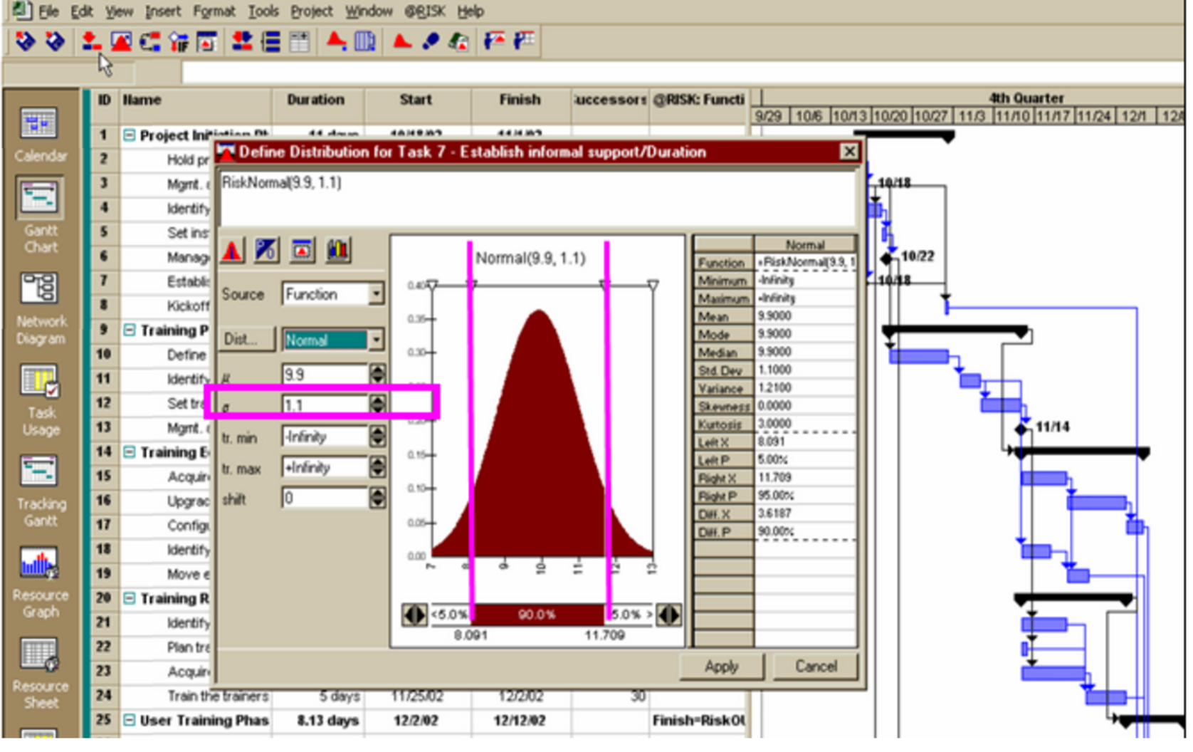
Figure 28 - Showing the Results of a Monte Carlo Simulation
Source: @Risk for Projects Online Users Manual Tutorials
Worth explaining at this point is in previous examples we MANUALLY converted Skewed Right data to turn it into a bell curve, when using simulation software, there is no need to do so as we can pick the distribution which most closely resembles our actual data distribution. However, experience has shown that in MOST CASES, when using historic cost, productivity or duration data, the distribution of that data takes the shape of what is shown in the adjacent graphic as a Poisson, Rayleigh, Weibull or Gamma distribution (Skewed right) while when we use Nominal Group Technique or any of the brainstorming methods which require a “best case, worst case and most likely” response from our subject matter experts we end up with a Triangular distribution. Again, one which is usually skewed to the right.
The reason we almost always end up with data that is skewed to the right is because often the “worst case” scenario are extreme outliers, which tends to push the right hand data points out further. Explained another way, the “Best Case” and “Most Likely” values tend to be fairly close to one another, while the “Worst Case” is almost always relatively far to the right of the mean.
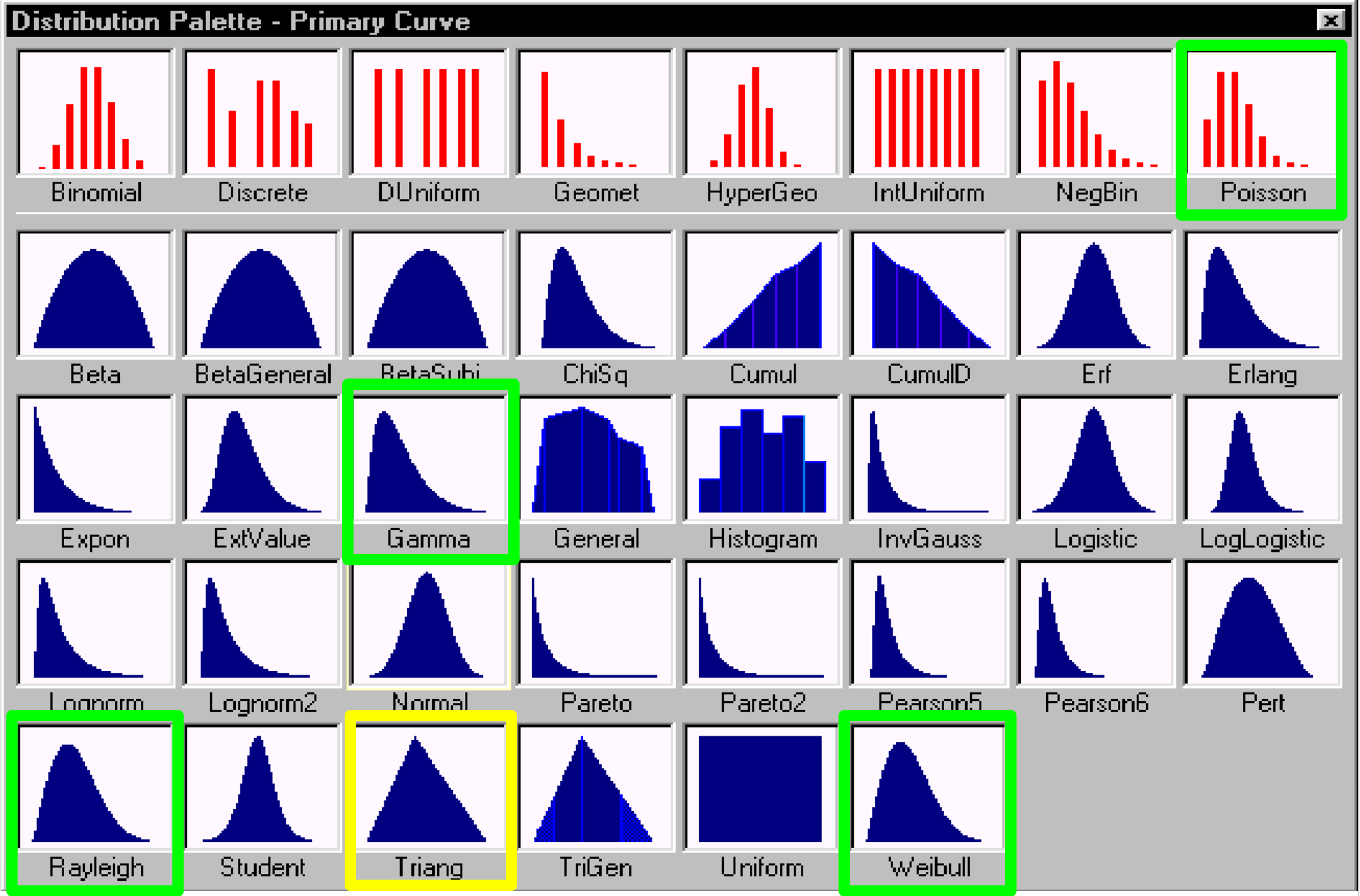
Figure 29 - Data Distribution Selection Window
Source: @Risk for Projects Online Users Manual Tutorials
When using Monte Carlo Simulation, it is important to select a distribution which is close to what the real data distribution is, as the software uses that distribution as the basis to make the random number selections.
Using such a range of durations, the Monte Carlo technique makes the analysis of duration uncertainty and activity relationships risks possible. Monte Carlo analysis runs a large number of iterations based on the spread of the three duration estimates, so that many combinations of durations are used.
This probabilistic approach recognizes that the more accurate way to model uncertainty in durations is through the use of statistics, where if enough iterations are run, the results will generally fall into one of the common probability distributions of activity durations. One of those probability distributions that is commonly seen and used is the “normal distribution”, which graphs into a bell curve with the most likely duration at the highest peak of the curve and smaller probabilities as the curve diminishes in both directions.
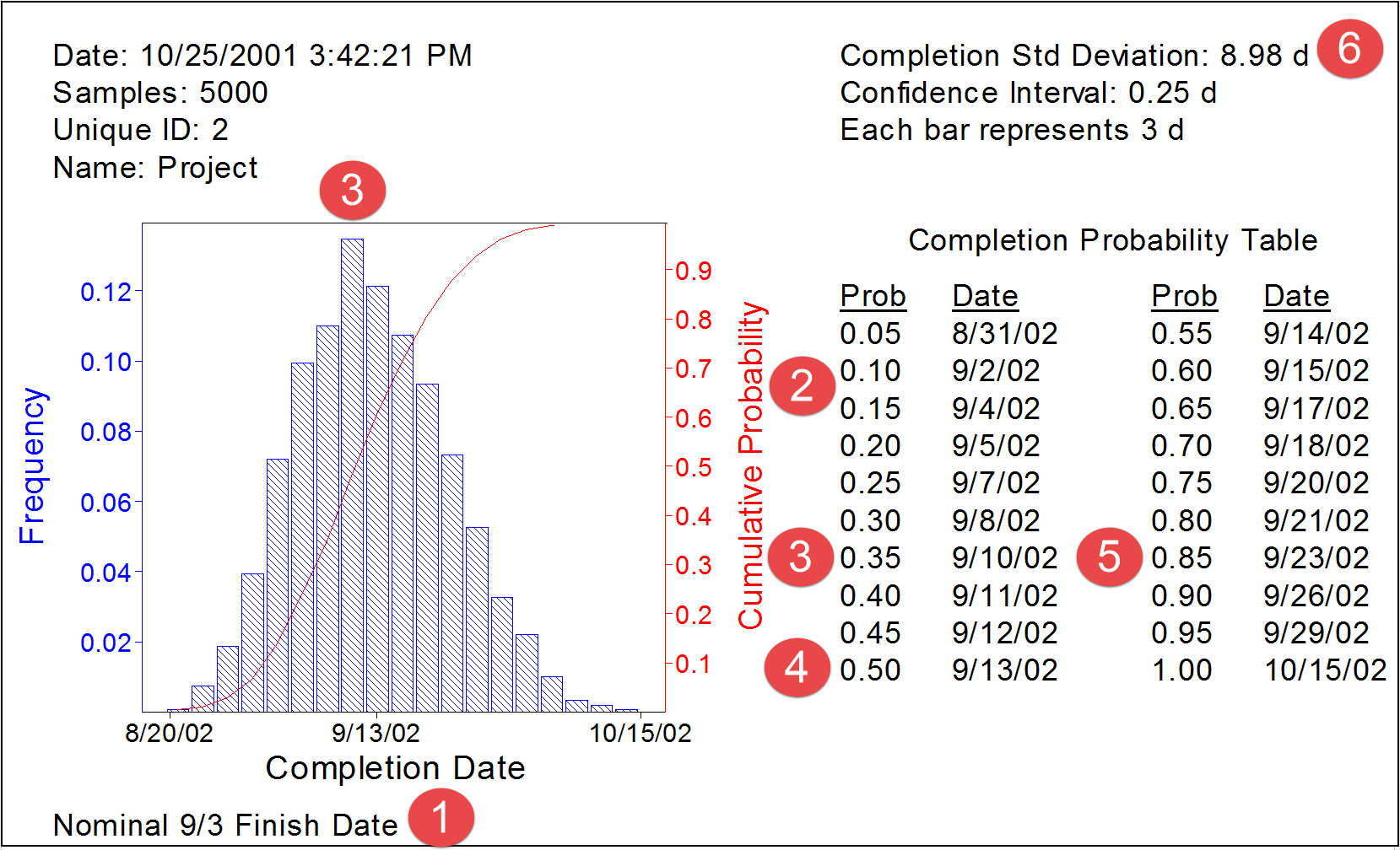
Figure 30 - Example of Output from a Monte Carlo Simulation
Source: Hullett, David (2002)
In the example above, a simple project schedule was simulated.
(1) The target finish date established by management was 3 September
(2) The probability of finishing on/before that date is about 13%
(3) The “Most Likely” date of finishing is around 10 September which as a “probability” (P) of about 35% (P35)
(4) The probability of finishing on or before 13 September is 50% (P50) which means that the project has a 50% chance (P50) of finishing later. This is the DANGER of using “average” or “mean” durations in our schedules.
(5) The P85 (85% probability) of finishing on or before would be on 23 September.
(6) For those familiar with statistical analysis (See Module 4 Managing Risk and Opportunity_ the Standard Deviation or Sigma (δ) is 8.98 or 9 days.
This is the whole purpose of testing the “as planned” schedule one last time before formally issuing it as a baseline schedule. IF we as project control professionals were to do this AND we were able to make a compelling example to the key decision makers as to why their project completion dates were unrealistic and assuming we can convince them to listen and heed our advice, then not only would more projects finish on time but there would a lot fewer claims and disputes on projects than we currently have.
The Monte Carlo analyses provide statistically significant “confidence levels" for the probabilistic prediction of achieving specific or targeted completion dates and - since schedules are dealing with unknowns - enable the schedules to have higher probabilities of meeting the chosen completion date. One weakness with Monte Carlo simulation is that it doesn’t take into account good project controls, where analysis and feedback from periodic updates is used to modify the plan. With the use of good project controls, it is much less likely that the stacking of pessimistic durations as happens in the simulations would go unnoticed and unmitigated. However, Monte Carlo simulation provides a number of very useful metrics as well as producing comparative evaluations of completion probability.
The Monte Carlo methods are available in numerous computerised software packages which can be linked to the scheduling software or are built into the software.
In addition, the level of detail in the schedule is an important requirement for use with risk analysis. There must be enough detail to isolate each activity by responsibility. This means that, for a schedule to be used in risk analysis, an activity should only model one discipline or party. This allows evaluation of each discipline or party for different assumptions of risk, as well as evaluation of areas for different risks. This is good scheduling or programming practice in any event, so it is in the best interests of the project for the schedule to contain this level of detail.
The use of constraints can affect the validity and accuracy of risk calculations because constraints may sequester float or prevent the network from calculating correctly. It may be necessary in the risk analysis to remove constraints in order to see the impact of those constraints on project completion. In addition, the use of mandatory constraints that do not allow the network to calculate float accurately in delay or gain is problematic and might render the schedule an inappropriate candidate for a risk analysis. Good practice in schedules suggests the minimum use of constraints, and avoidance of mandatory constraints that do not allow the network to calculate delay or gain, so following this practice will improve the results from Monte Carlo simulations as well as improve the quality of the schedule or programme.
Just as in any analysis of a schedule, the more calendars that exist in the schedule, the harder it is to analyze, whether for delay or risk. Multiple calendars with many shifts from calendar to calendar along critical paths will amplify or reduce the total float values. Good practice suggests minimum use of calendars, so following this practice will improve the results from Monte Carlo simulations as well as improve the quality of the schedule or programme. However, the project model should reflect the real situation and should use as many calendars as are necessary for accurate modelling.
The risk management plan is based on the schedule network calculations, whether using Monte Carlo analysis or what-if scenarios. So if the network does not calculate correctly, the value from risk management is severely reduced. This means that another of the generally accepted scheduling best practices, the limitation of open-ended activities to the first and last activities, is vital to risk management analysis.
With Monte Carlo analysis, the iterations are run with multiple values of activity durations, so those durations have to be reasonable, comparable, and ideally limited to one update period or less.
Lastly from the standpoint of risk, the topic of “merge bias” is covered in greater detail in Module 7 - Managing Planning and Scheduling, but the only way to effectively measure or assess the risk impact of “merge bias” is through the use of Monte Carlo Simulation.
04.4.3.07 - Ranked Ordering Using Expected Monetary Value
Refer Column J in Figure 2 above – Ranked Expected Monetary Value. In order to prioritise the risk events the “impact” is ordered / ranks so that events can be reviewed or reported on in order of extent of impact.
Explained in more detail by using Expected Monetary Value obtained by multiplying the probability of the event happening x the impact or consequences if it does happen, provides us with a weighted value. Thus if you had a a high impact event (e.g. Deepwater Horizon) with a very low probability of happening, it should come up near the top, when if you rank ordered by probability alone, it would have been at or near the bottom.
Likewise for an event with a very high probability of occurring but only a relatively moderate expensive cost or time impact, then if we sorted only on amount at stake (impact or consequences) it would probably not rank high enough to be of concern.
Important to note here is that from a management decision making process, invariably management will establish a cut-off point based on the EMV and any risks with an EMV lower than that thresh-hold will be ACCEPTED.
In terms of Opportunities, the same principle applies. At some thresh-hold of EMV, management will opt to IGNORE potential opportunities, as the combination of potential savings or benefits X the probability, are not worth the time or effort required to exploit them.
04.4.4 - OUTPUTS
- PRIORITIZED RISKS/OPPORTUNITIES SORTED BY EMV
- CONTINGENCY CALCULATIONS (COST AND TIME BUFFERS)
- UPDATES TO THE RISK/OPPORTUNITY REGISTER
- UPDATES TO OTHER RISK TEMPLATES
04.4.5 - REFERENCES & TEMPLATES
- National Defense Industrial Association (NDIA 2014 Integrated Program Management Division) “A Guide To Managing Programs Using Predictive Measures" Chapter 5, Page 81 and Figure 25 Page 64
- US Federal Aviation Administration Risk Management Handbook (2009)
- NASA Risk Management Handbook (2011)
- Jardine, Scott PricewaterhouseCoopers (2007) Managing Risk In Construction Projects
- University Of Adelaide (N.D.) Risk Management Handbook
- US Dept Of Transportation (2013) Transportation Risk Management: International Practices For Program Development & Project Delivery
- Wiersma Fred (2006) Goldratt’s Theory Of Constraints
04.5 - Module 04-5 - Risk / Opportunity Response Strategies and Tactics
04.6 - Module 04-6 - Risk / Opportunity Monitoring and Control
GPCCAR M04-4 - Assess, Prioritize and Quantify Risks / Opportunities, Revision 1.00